
Fuku Eatery & Desserts
Year : 2021
Discipline : Brand Refresh
Project Type : Food & Beverage
Scope : Identity Construction, Identity Projection, New Media Management
Problem
Through tedious observation and research for the independent business, Fuku’s overall brand impression was leaning towards an unintended commercialization. which did not align with the nature of an indie cafe. In addition, Fuku’s brand image lacked consistency in terms of its Japanese-inspired look and messaging. The lifestyle facet of the brand was lost in the process as well. Without a sound imprint of what the brand stands for, the eatery lacks proper brand identity for exposure.
Solution
We’ve proposed an identity makeover, from the brand’s personality, messaging, to its digital and physical appearance. The game plan was to re-introduce the new Fuku as a lifestyle destination, down-to-earth with a Japanese-inspired look.

Art Direction
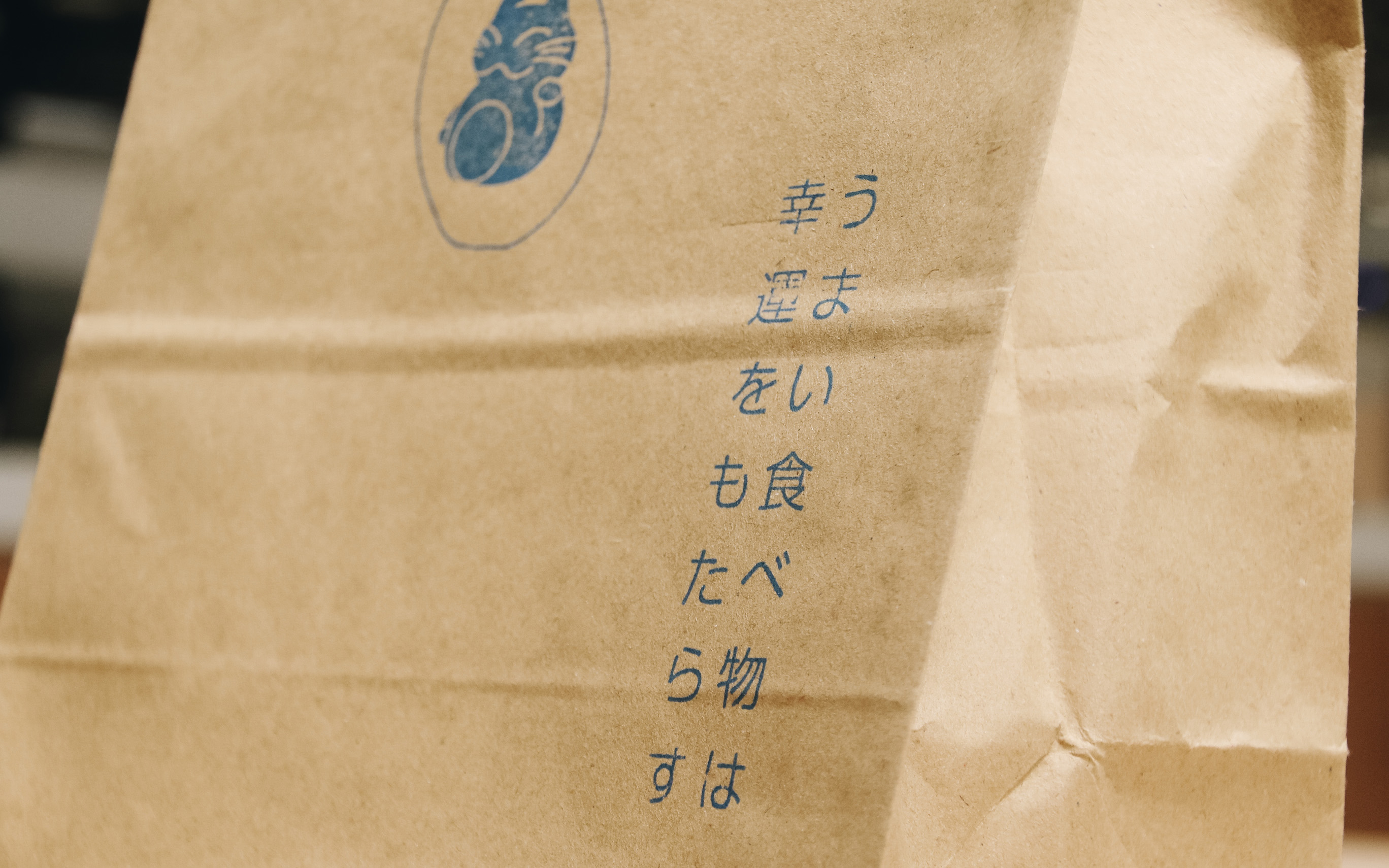
In an effort to humanise the business, “Mild as Spring” became the core message of the brand, in reference to the gentle weather of springtime. Building on to that concept, we injected a sense of craftiness, sincerity, and warmth, along with Japanese-inspired elements into the new look. These aspects are presented through its environment, products, people, and community engagement.
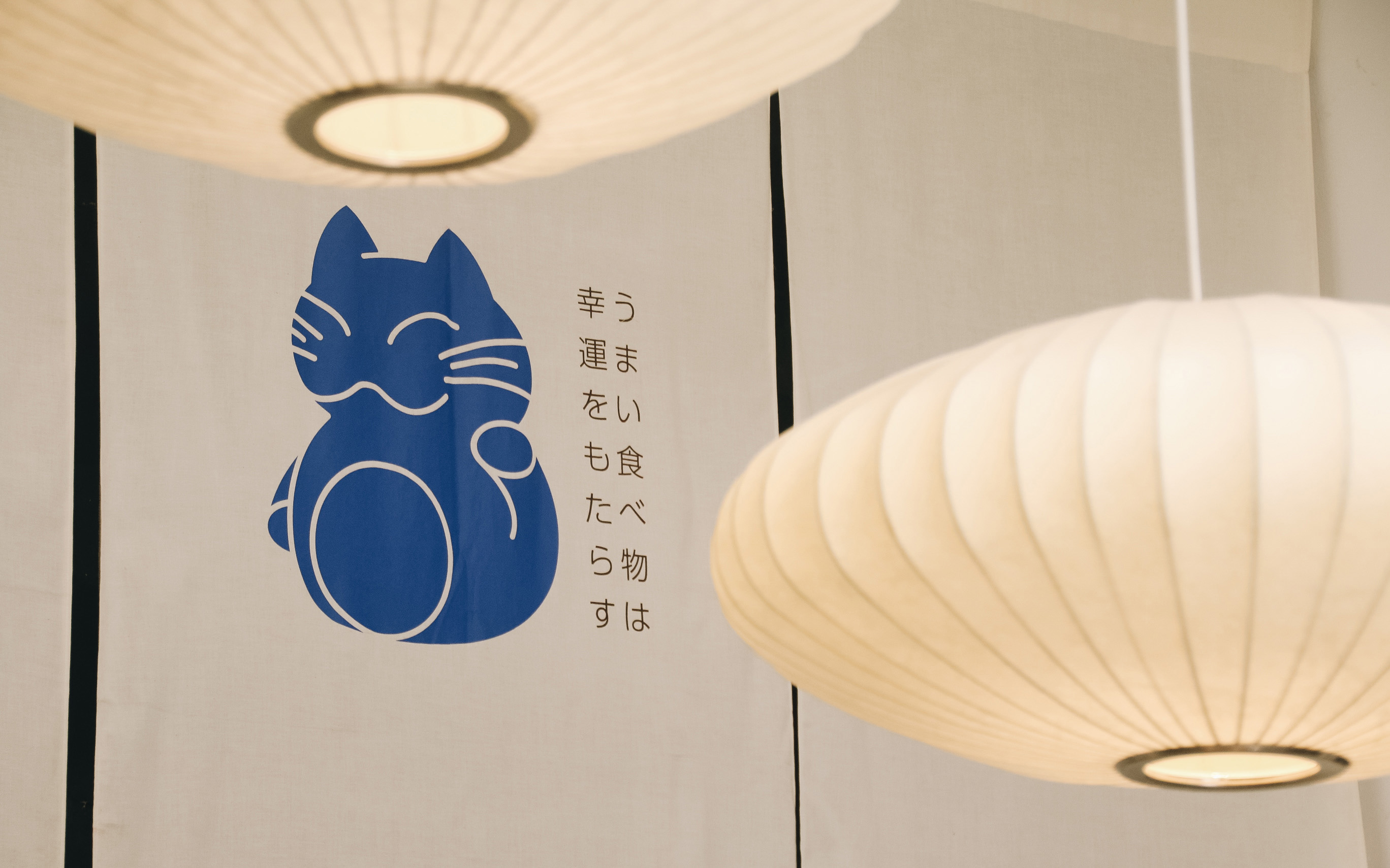
Subtle yet impactful alterations were made to the visual identity, the creative direction was skewed towards a craftier, down-to-earth look, evident in the typography and redesigned mascot. To elaborate, the brand’s mascot, “Dafu”, was illustrated with organic lines and curves to emphasize the Japanese element of the brand. Along the same lines of displaying craftiness, earthy tones were used and a pang of blue as an homage to the original Fuku.
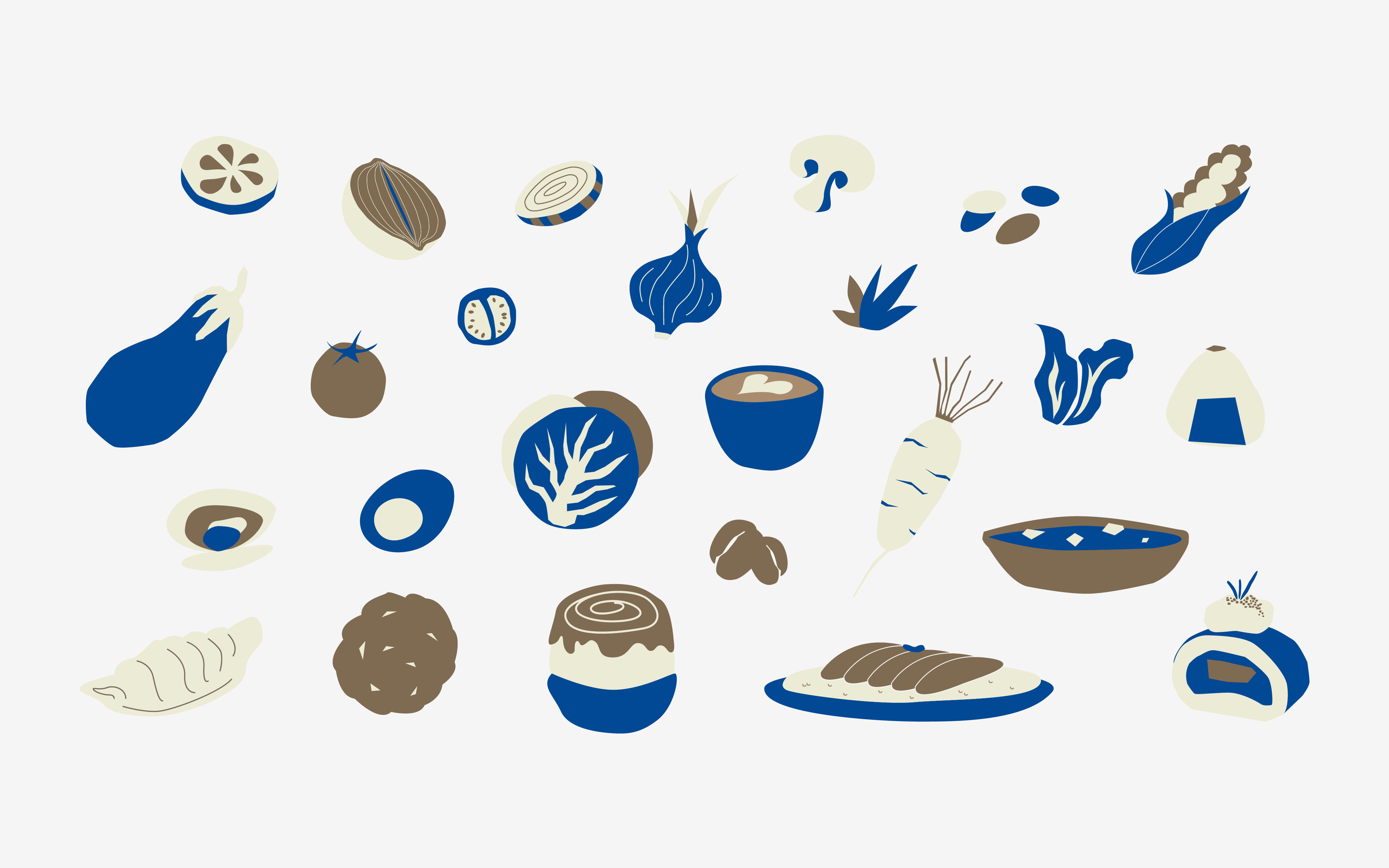
Much like Fuku’s offerings, these illustrations are drawn from scratch with organic shapes. Solely inspired by Fuku's kitchen ingredients, these elements echo well with the brand’s original intention of “good food brings good fortune”.
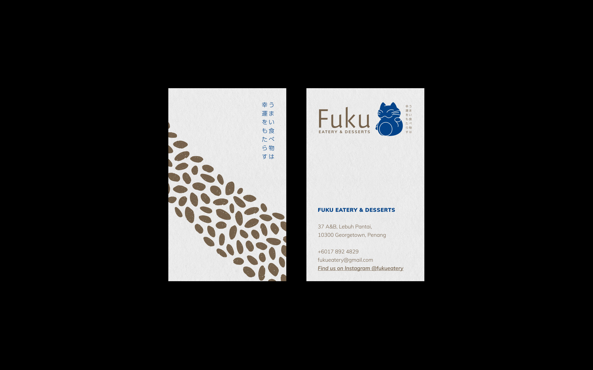
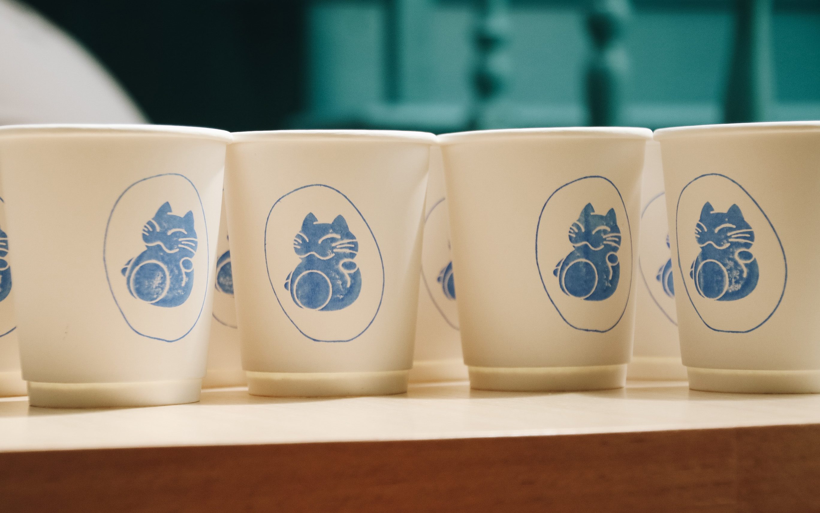
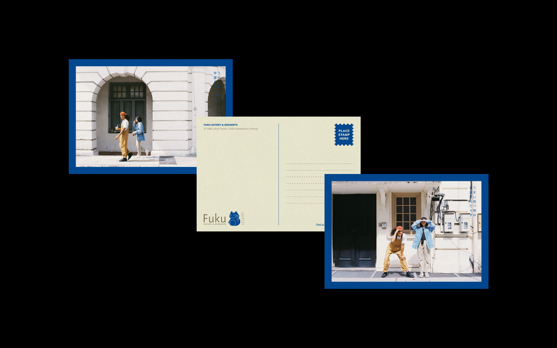
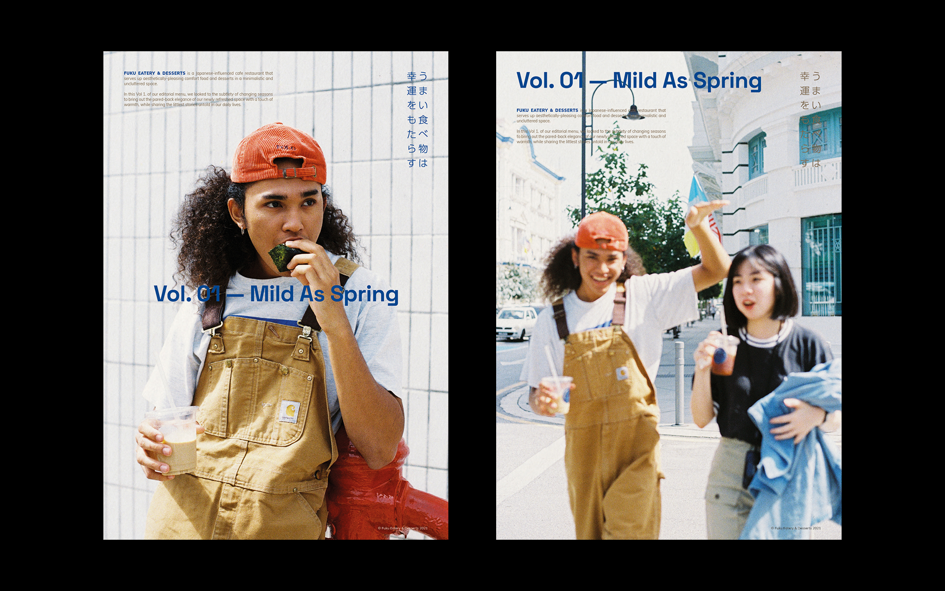
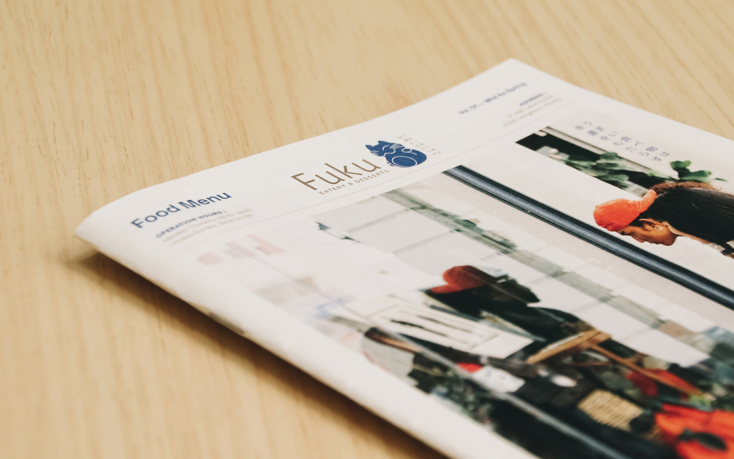
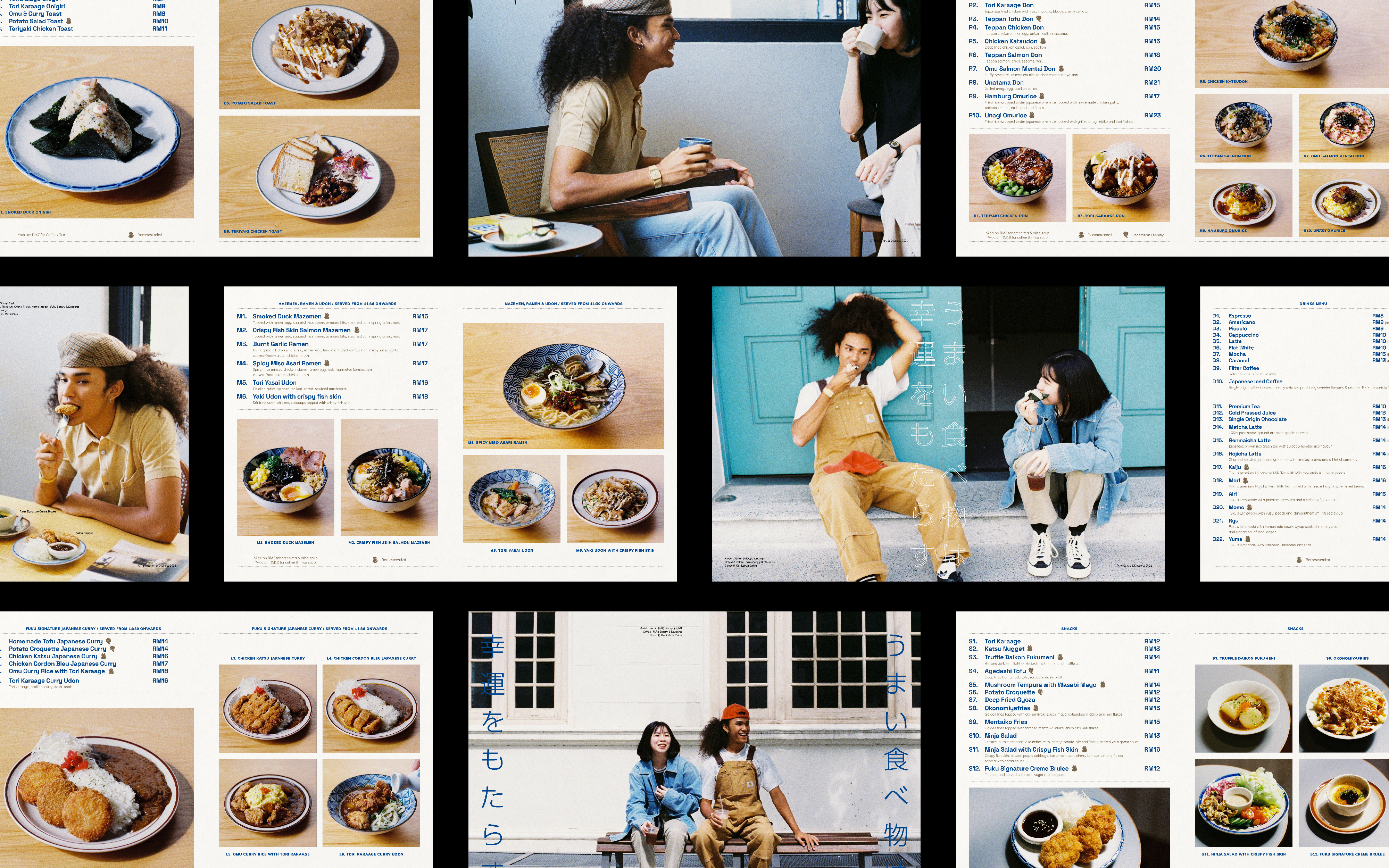
Application
With thorough research and analysis of Japanese materials, we’ve introduced an encompassing makeover to Fuku’s collaterals. Looking into film photography, an editorial menu design, and postcards, we sought to propel Fuku into a lifestyle destination and eatery.


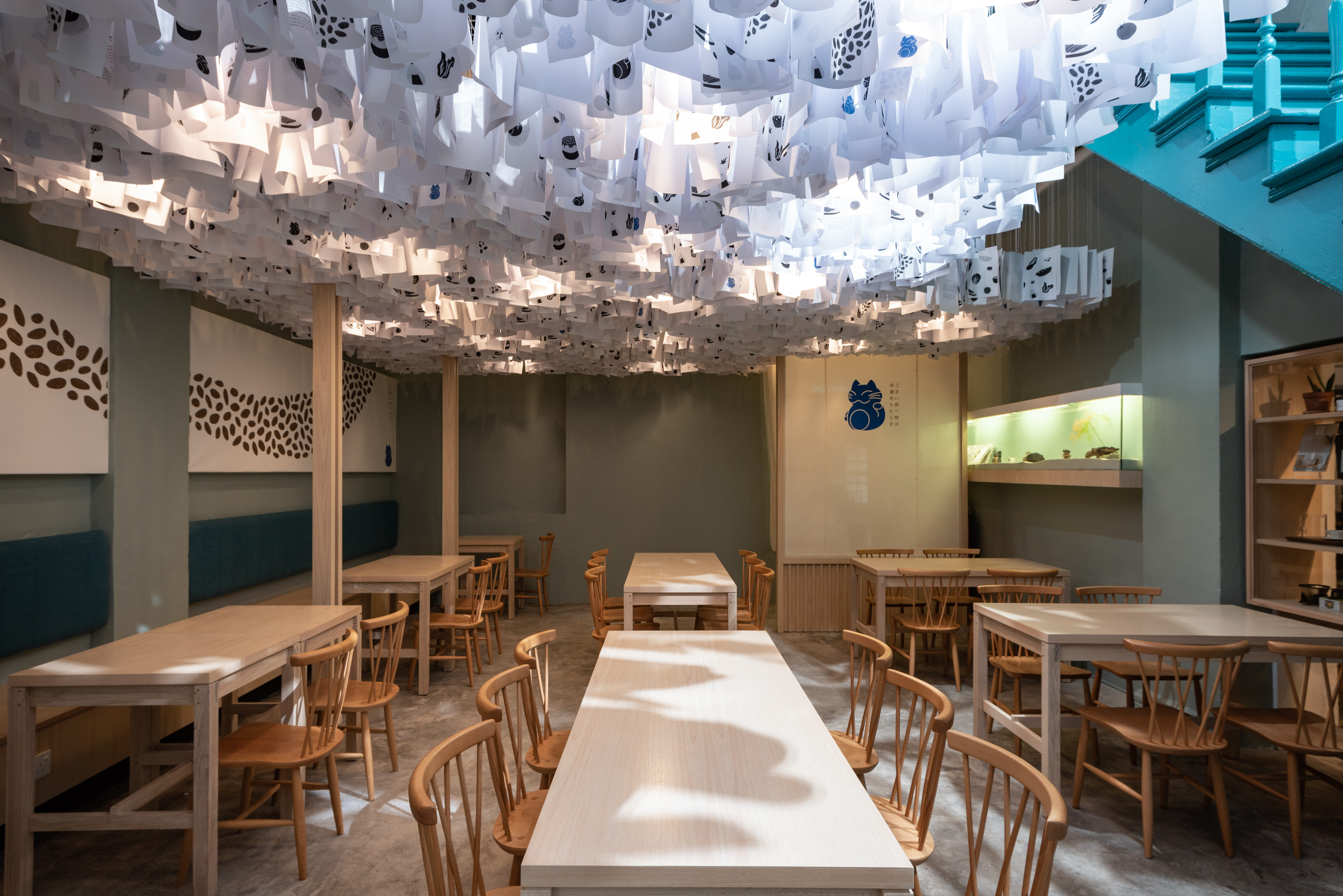

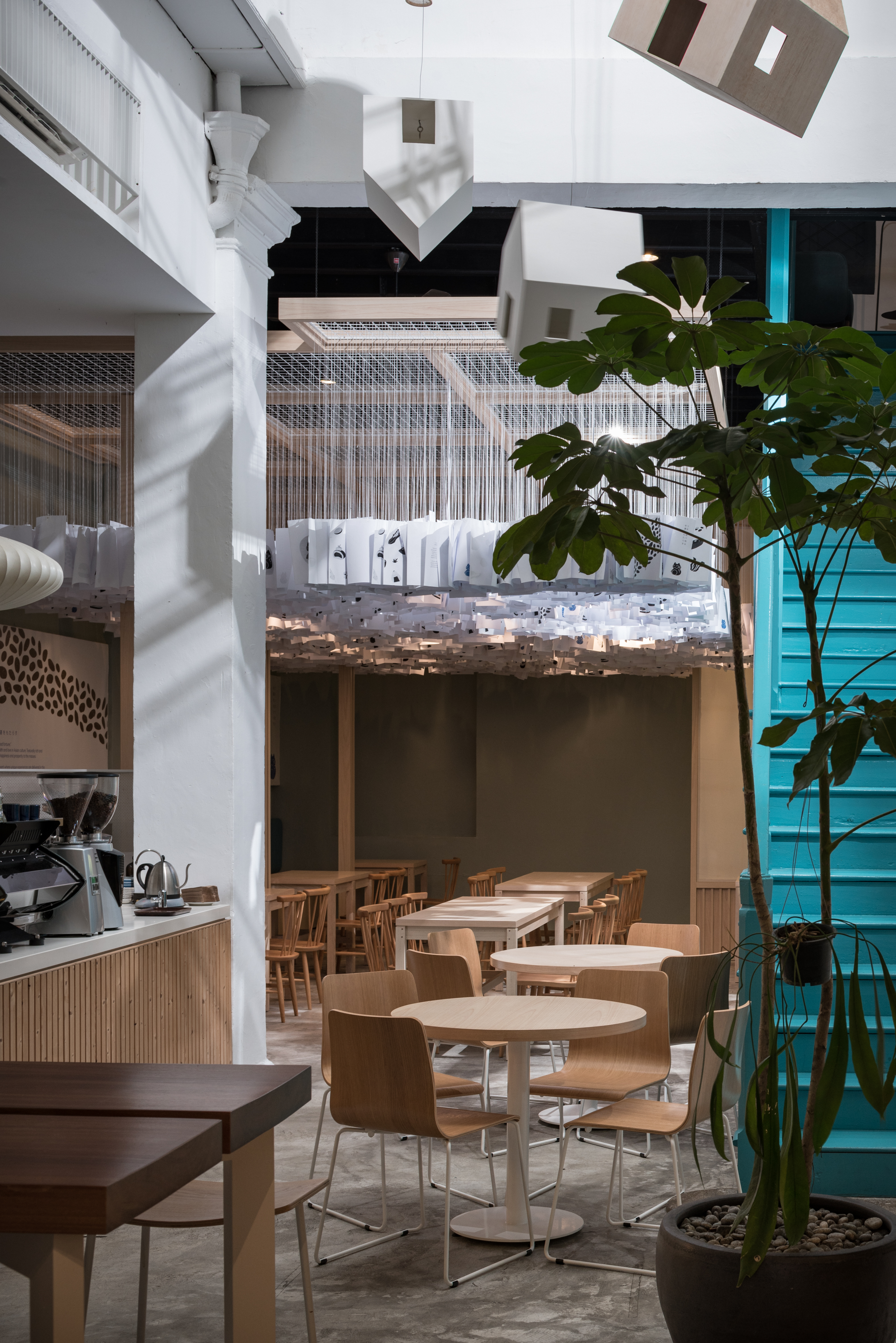

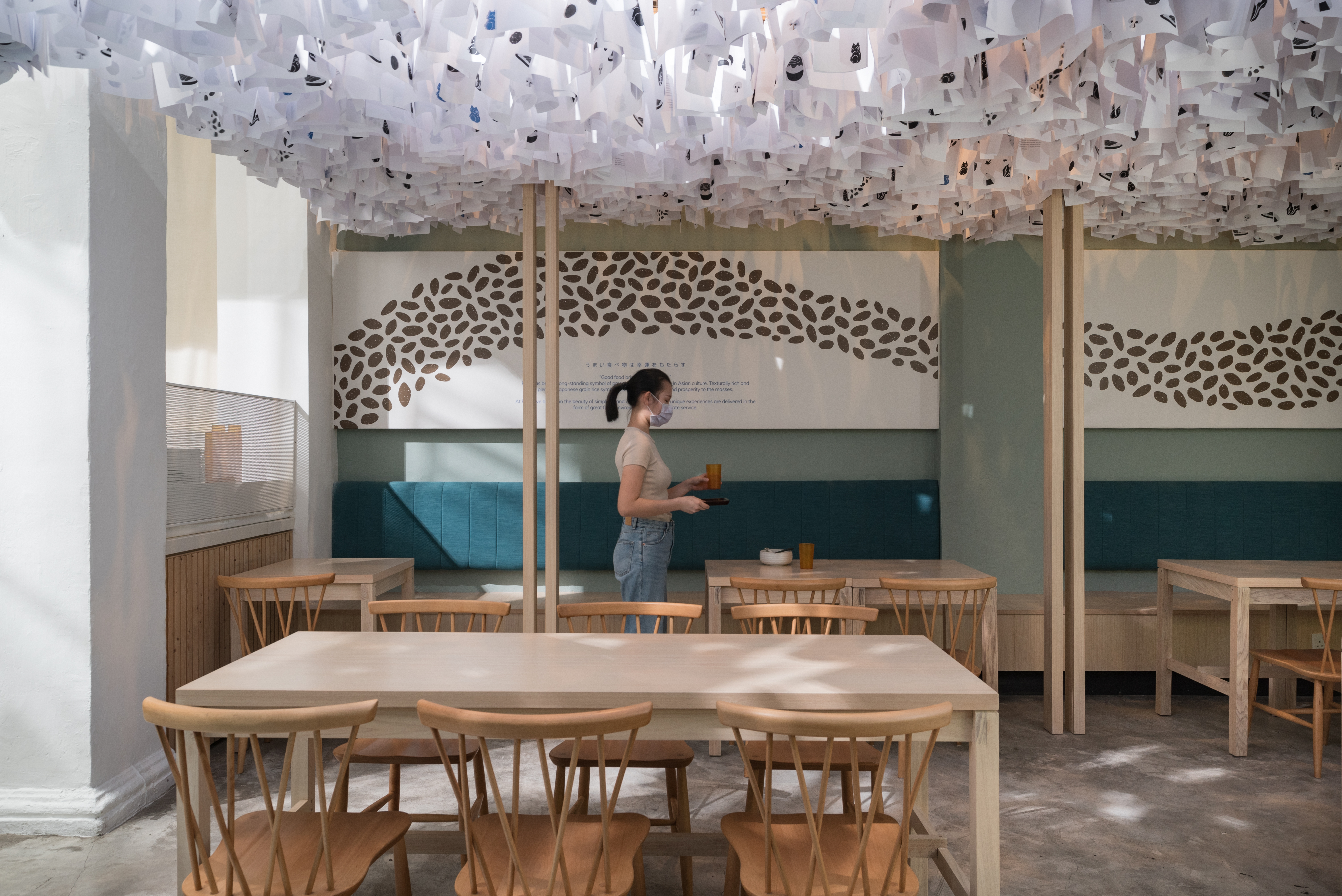
Interior
Working closely with our friends at Studio 11, “Mild as Spring” was brought to reality. Showcasing the brand’s craftiness, the relaunched interior features a creative yet unique installation, namely the “Paper Bamboo Forest” to create an immersive experience for the customers. Paying homage to local craftisans, the newly bespoke dining tables are made with authentic Semangkuk wood which features unique grains and lines in each table.