Landart
Year : 2020
Discipline : Rebranding
Project Type : Commercial
Scope : Identity Construction, Identity Projection, New Media Management
Problem
As Landart seeks to build a legacy by venturing into emerging markets in Southeast Asia, the company needed a fresh look to enter the international sphere. Lacking in depth and consistency across different mediums, the brand needed aid in refining their overall identity to reposition itself as a firm that offers additional services — Landscape Architecture, Interior Design, and Architecture.
Solution
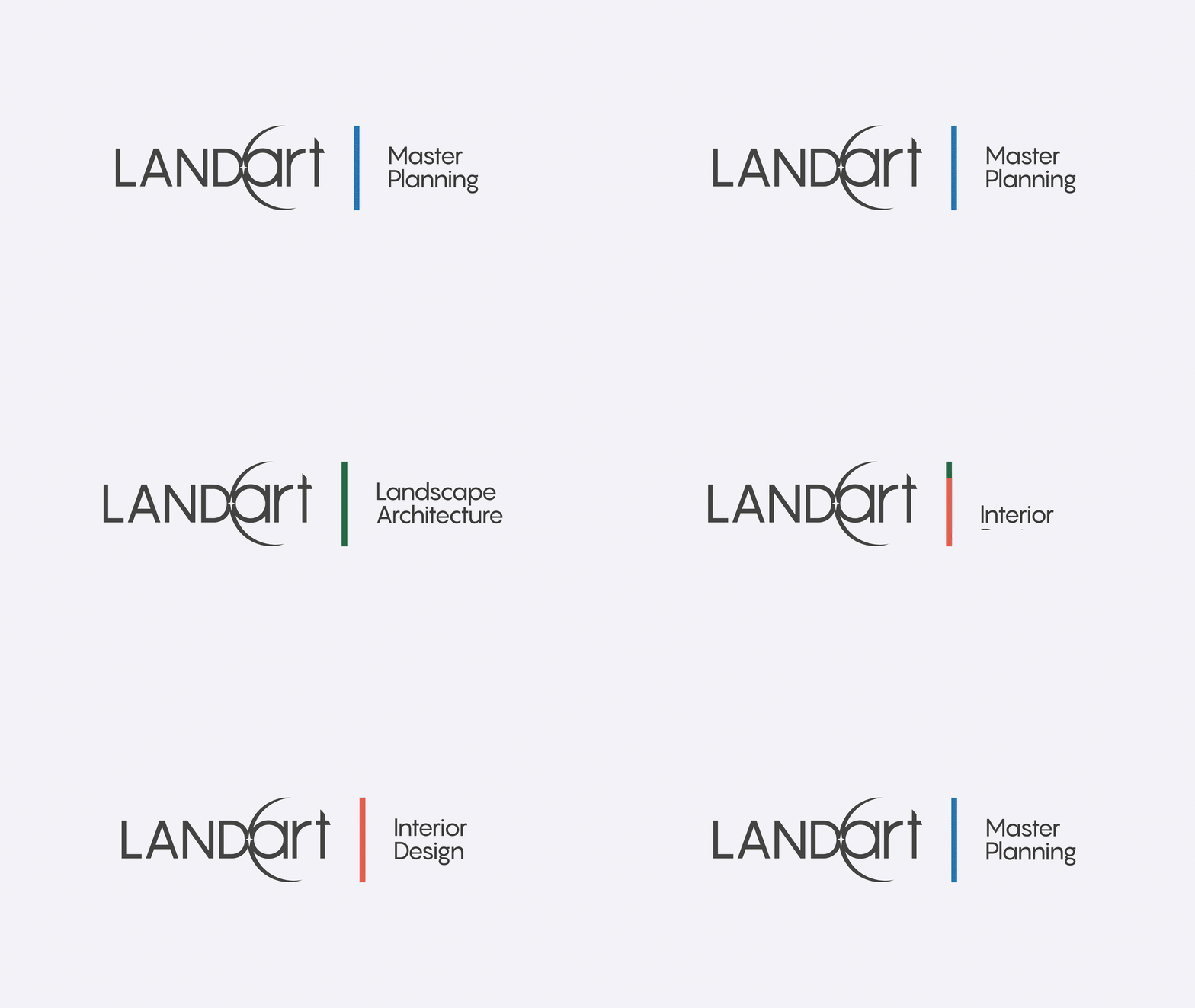
To prepare the brand for what’s to come, we fine-tuned their brand identity with a sophisticated and professional touch. A consistent brand system that helped the brand segregate their added services through an improved art direction and messaging across digital platforms, embedded with the brand’s concept, adding depth and value to its existing image.

Concept
Starting with the brand’s image, the initial concept starts from the view in outer space, overlooking the Sun’s peeking iridescent glimmer as it aligns with the Earth. The phenomena has inspired Landart to create harmonious spaces on the face of the planet that cultivates relationships between man and nature.

Ultimately, the concept is zoomed into “Nurture The Future”. With that, it encapsulates Landart’s belief in the symbiotic relationship between Space, People, and Nature. The concept represents the brand in its diverse services in transforming spaces that enhance the quality of life; its culture in fostering sustainable relationships; and its continuous efforts in preserving biodiversity in nature with innovative solutions.
Art Direction
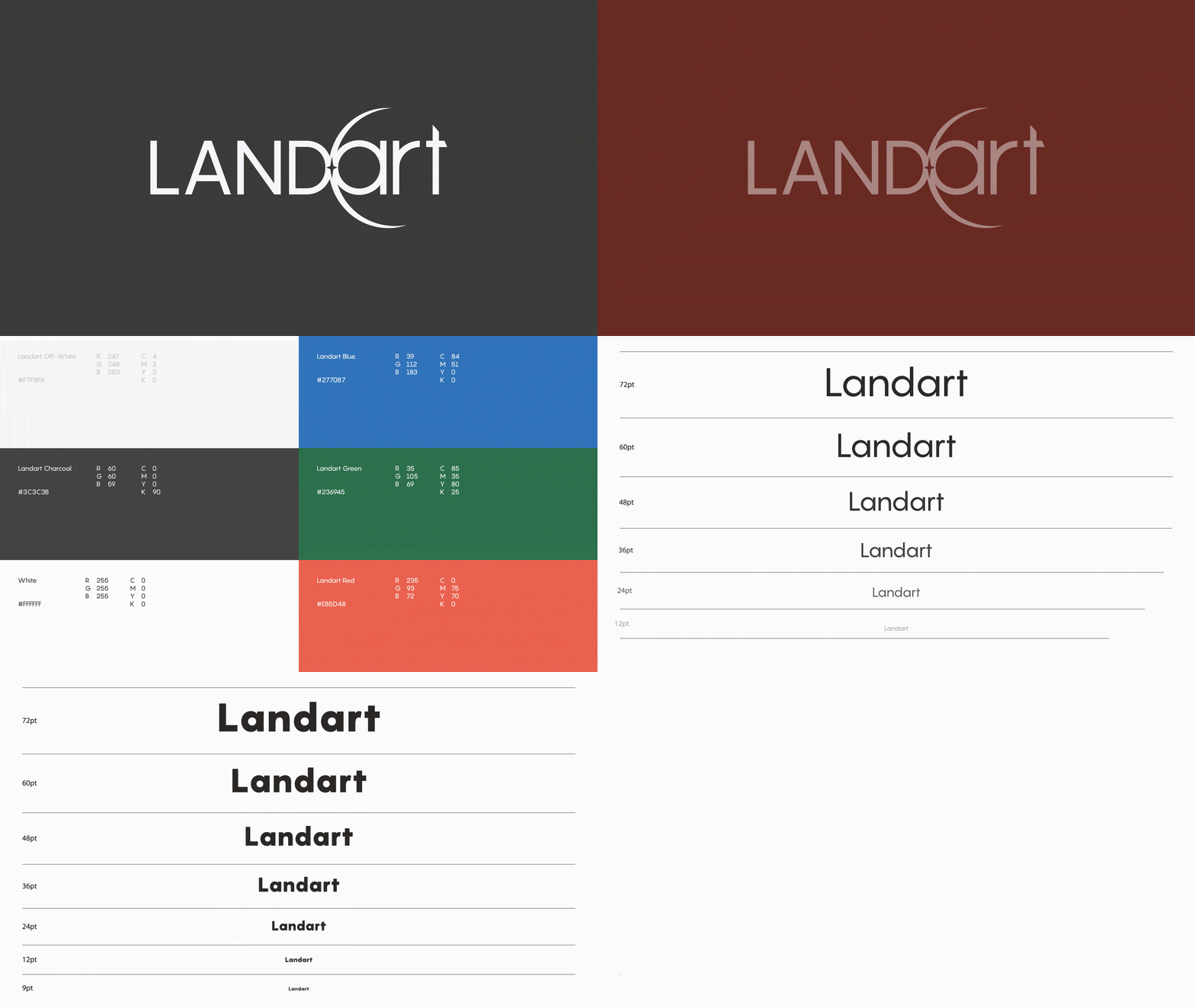
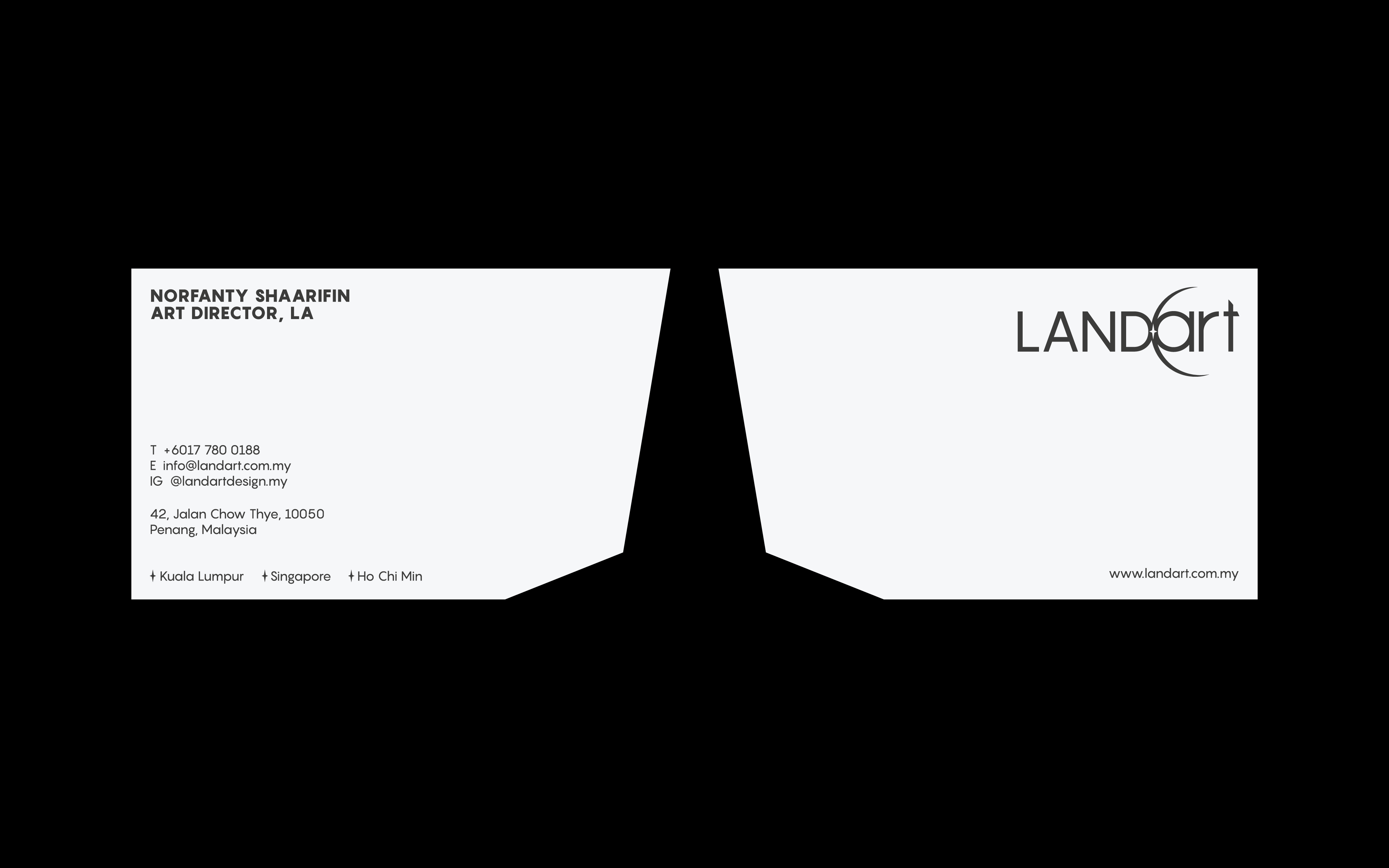
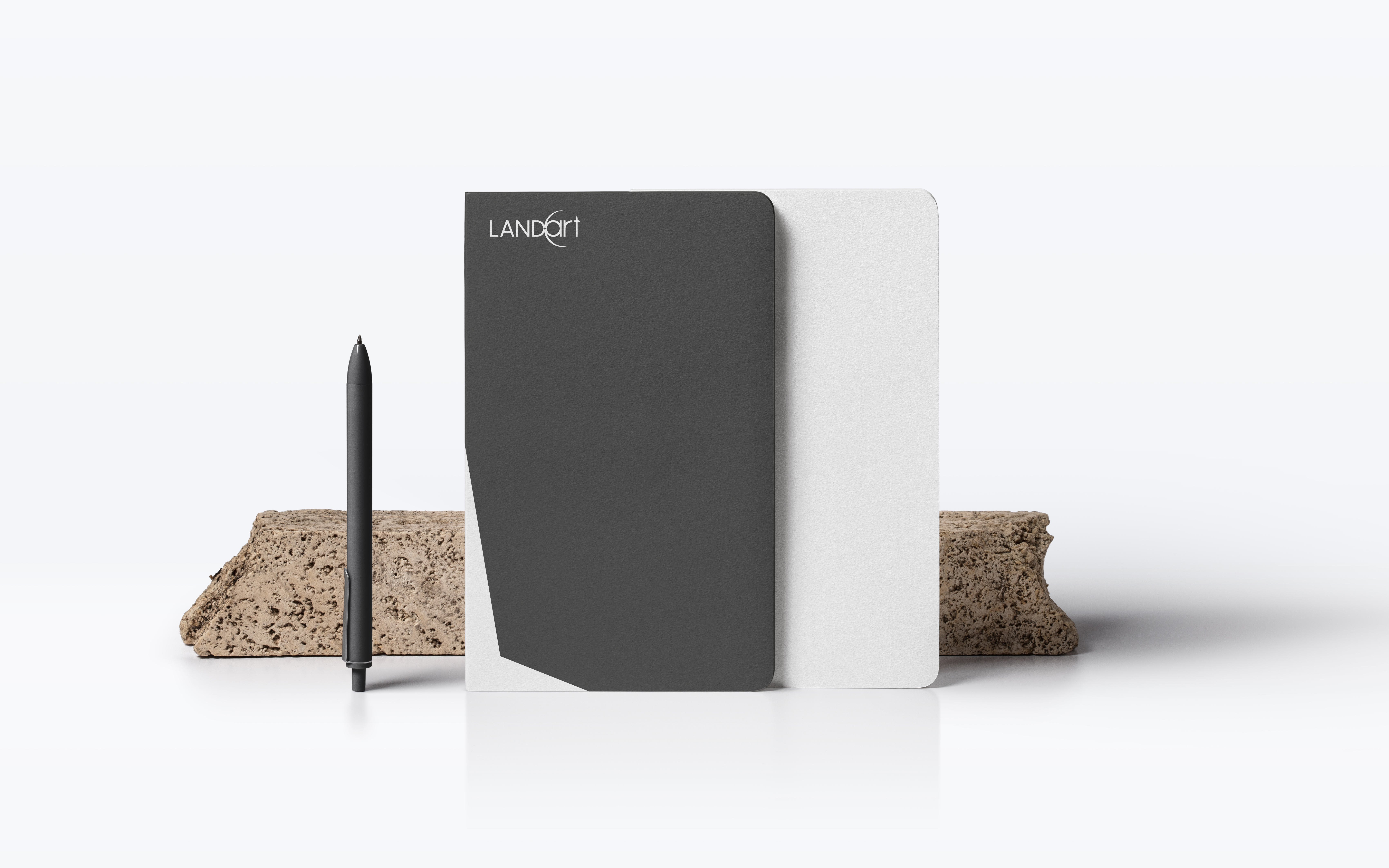
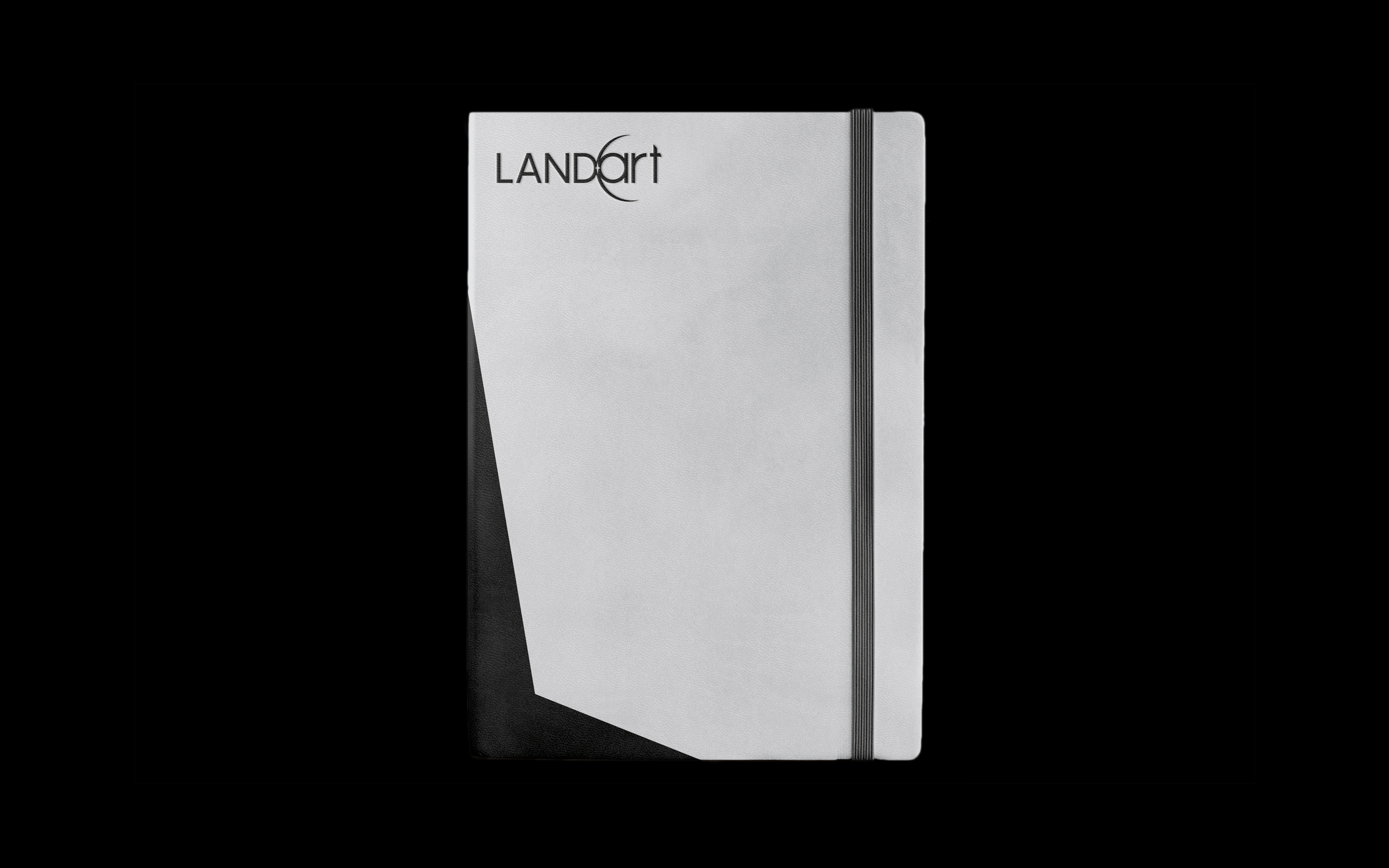
Landart encompasses dynamic, artistic, and professional as its core personality. With that, we proposed an identity that arms them in their next step forward in the industry. The refreshed identity is led by a uncluttered, professional visual identity, and complemented by bold brand colours that represent the departments in the company.
Logo Reconstruction
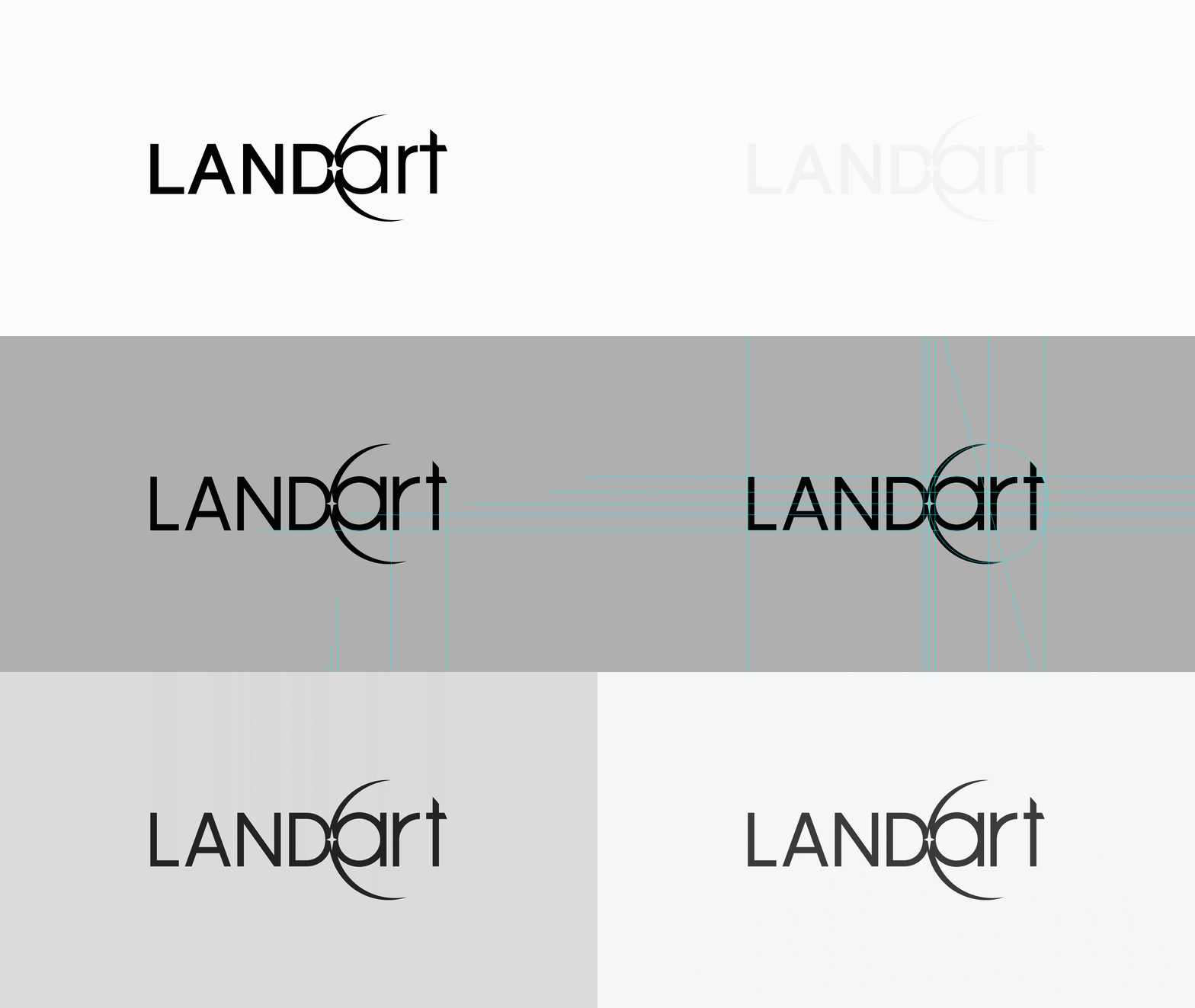
Equipped with a contemporary perspective, the previous logo was refined with subtle yet impactful adjustments. Through dissection and analysis, we’ve employed modernised techniques to introduce a modern-day interpretation of the brand’s previous logo.
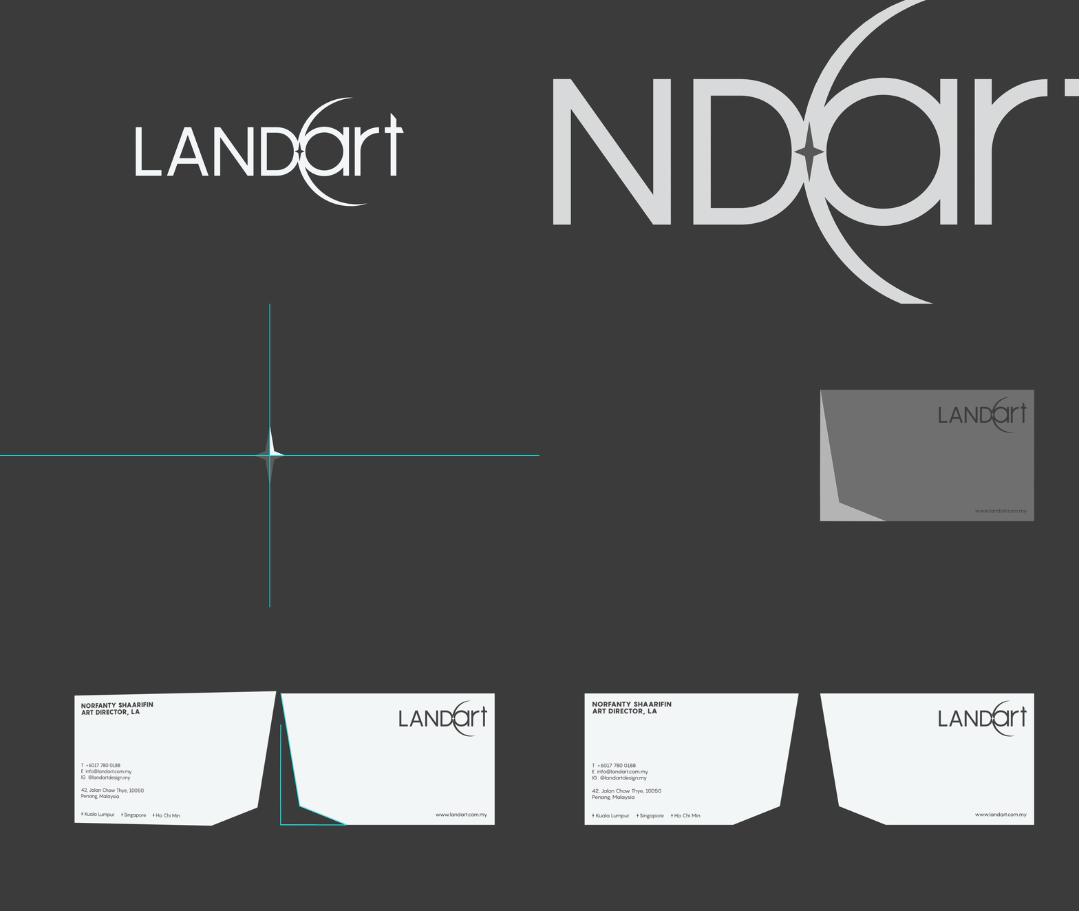
Derived from the concept, the star was inspired by the iridescent glint from the Sun. At the same time, it serves to represent Landart as the leader of the industry. With that, we have expanded this prominent element across the brand’s visuals in print and digital applications.






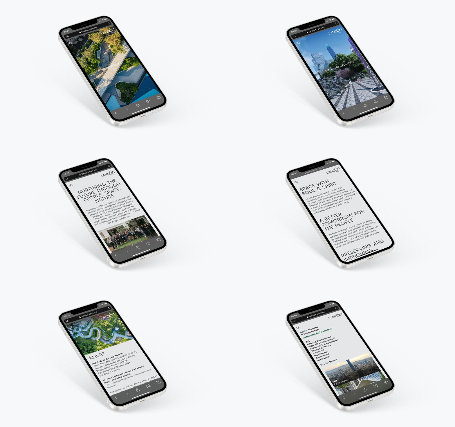
Website
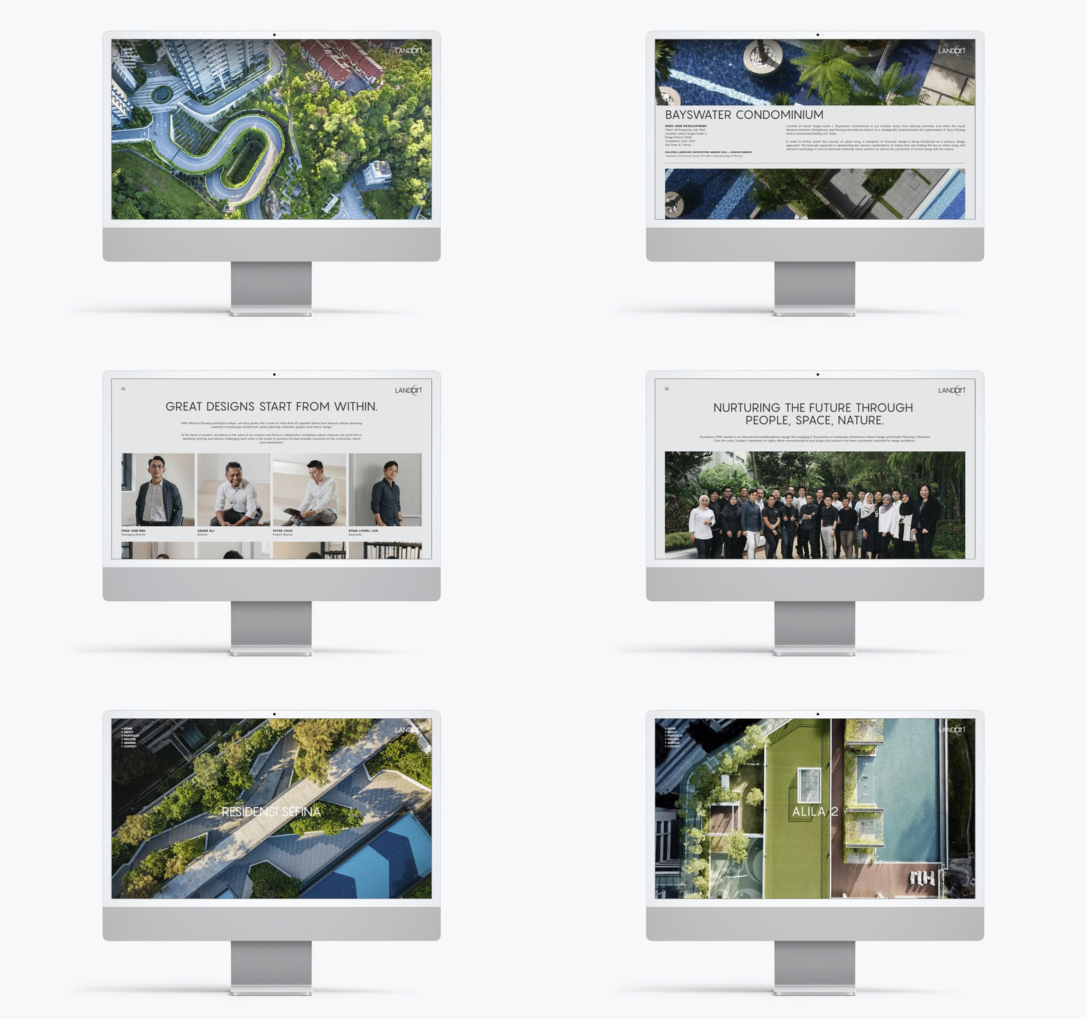
As the brand transitions into a future-ready multidisciplinary company, we revamped the brand website that gives audiences a fresh take on Landart. Using the brand’s colours assigned to each of the firm’s disciplines, as well as showcasing the ‘star’ element in subtle but noticeable ways in the site, we’ve presented a website where the brand’s identity is consistently displayed across the platform.
www.landart.com.my